
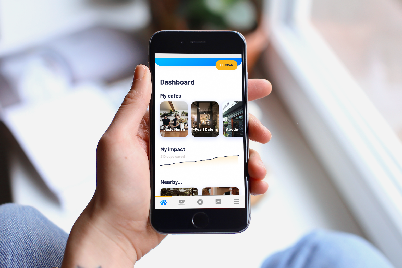
Joe
Enjoy your coffee, and save the environment while you do – with Joe.
Joe is an app designed to encourage more people to use reusable coffee cups, in an effort to reduce the massive amount of disposable cups that end up in landfill every year.
This was an entirely self-driven project, meaning I was responsible for all major deliverables, and all within 12 weeks.
The process consisted of preliminary user research, developing the UX approach, prototype wireframing, strict usability testing, and hi-fi design mockups of the app.
Preliminary user research
I conducted a short round of preliminary user research interviews in order to gain a deeper insight into their coffee drinking routines and habits. From these findings I compiled a large amount of data, and was able to condense it into meaningful categories in order to develop user personas.
These personas were referred to consistently throughout the rest of this process, to ensure I could better visualise and understand exactly who I was designing the product for; as a result I was able to remain focussed on the scope of what I was trying to achieve for these users, and prevented me from getting too ahead of myself.
Key User Pain Points
Based on the preliminary user research, as well as the goals of the user personas developed, the main pain points for people with their coffee routine (and using a reusable coffee cup) are:
Losing or forgetting their loyalty cards
Paying for, and carrying a reusable cup around before/after using it
These are two extremely simple pain points, but in a routine as frequent as many coffee drinker’s is they can become extremely frustrating. The Joe product aims to reduce the irritation of each of these simple issues in an equally simple way – but in a way that will also help reduce the environmental impact that comes as a result of a regular person’s coffee habit.
Prototyping in Axure
User flows were mapped out to analyse how a user would achieve certain goals within the app step by step. Creating detailed user flows is also a great tool to help predict any mistakes or errors a user might make, and figure out how to get them back on track.
The first iteration of the Joe prototype was built in Axure 9, in a fairly low-fidelity capacity. However each of the key tasks a user might engage in with the Joe app were built out, including avenues for certain errors user might make as well. This is a crucial step before undertaking user testing, as it is very important to see how users interact with the task paths – whether good or bad.
User testing and design iteration
Over the course of a few days, several users who were recruited in relation to the earlier key identified personas were tested under close observation as they interacted with the Joe prototype for the first time. From this, a usability report was developed, and based on what was observed there were several key recommendations recorded for the next phase of the Joe app’s development.
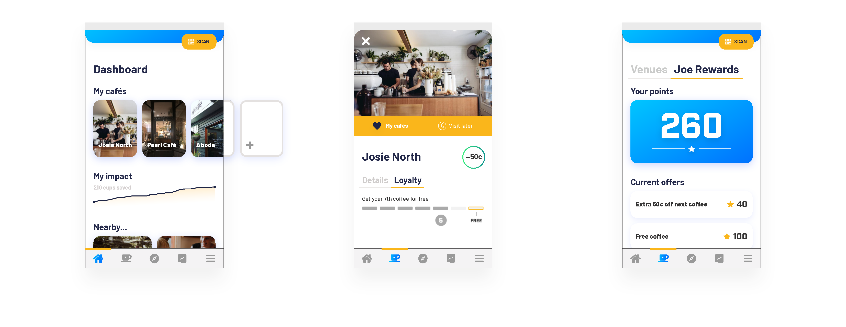
Heading in to the next iteration, I developed a comprehensive annotated wireframe specification document be used by the devs; and in addition, I designed high fidelity mockups of 3 of the app’s main screens. This design stage involved some more research, but this time into a number of current UI trends, and benchmarking several design decisions against the UX practices of apps relevant to my developed personas.